842浏览
36喜欢
14复制
图像格式
生成提示词
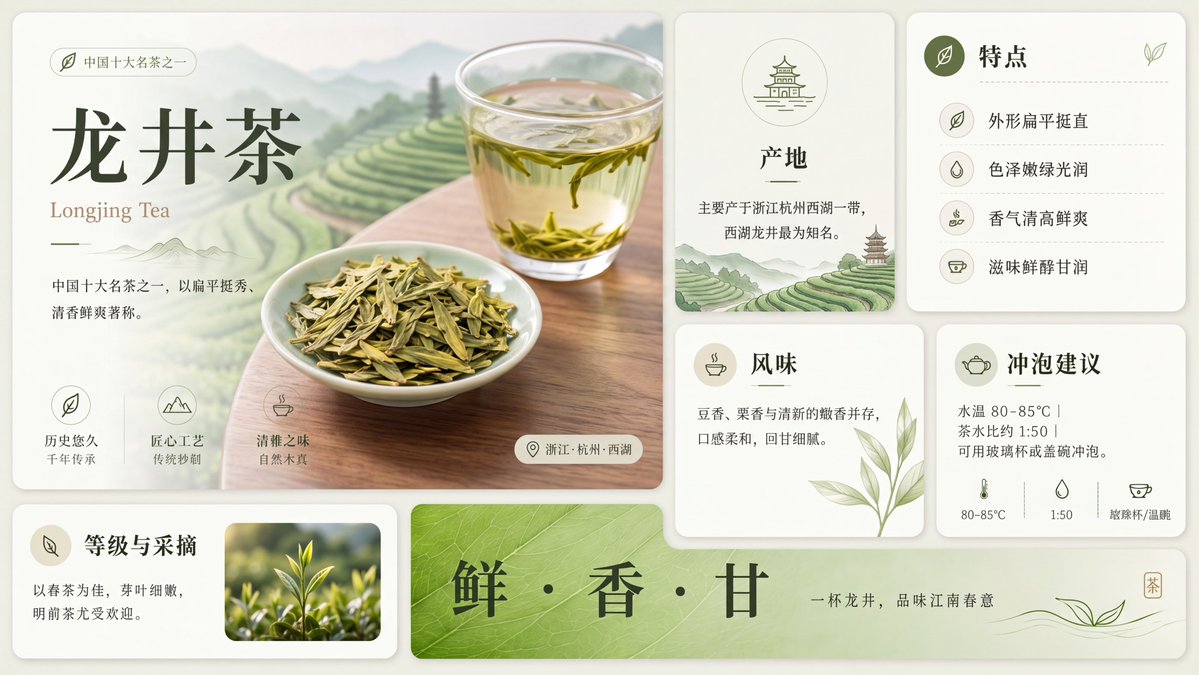
Using the provided reference image, redraw and upscale it into a cleaner, sharper, more polished version while preserving the same overall infographic layout, all original text content, and the Longjing tea theme. Keep the product title {argument name="tea name" default="龙井茶"} and the English subtitle {argument name="English tea name" default="Longjing Tea"} unchanged. Goal: Make the image look less like a rough GPT-generated graphic by removing broken, noisy, meaningless textures and replacing them with crisp, intentional detail. Enhancements to apply: Increase resolution and clarity; sharpen typography, icons, borders, tea leaves, glass, and card edges; make the lighting softer and more natural; improve material realism for the tea, cup, dried leaves, and ceramic dish; clean up any fuzzy or fragmented artifacts. Meaningful detail additions: In the main hero panel, replace the vague pale background with a refined scenic tea plantation landscape of layered green terraces, misty mountains, and a wooden tabletop beneath the tea cup and plate. In the origin card, add a small matching tea-terrace landscape illustration at the bottom. Make the bottom green banner more vivid with a natural leaf-vein texture. Layout constraints: Preserve exactly 7 visible content panels/sections: the large hero panel, origin card, features card, flavor card, brewing suggestion card, grade-and-picking card, and bottom slogan banner. Preserve exactly 4 feature rows in the features card, exactly 3 small icon benefits in the hero panel, and exactly 3 brewing parameter icons along the bottom of the brewing card. Do not add extra sections, extra labels, watermarks, logos, or decorative clutter. Style: Elegant Chinese tea brochure design, cream-and-sage palette, refined minimal UI cards, soft shadows, crisp vector-like icons, realistic tea photography elements, calm premium product-advertising finish.
AutoAGC workflow
转化为可复用工作流
- 复制提示词正文,保留角色、任务、模型、风格和输出约束。
- 在 GPT Image 2 或同类模型中粘贴,并上传参考材料或工作流 brief。
- 根据输出格式、品牌语气、多语言版本和执行目标替换最后一段限定条件。
Asset
资源预览
- 素材类型
- 图像
- 模型
- GPT Image 2
- 场景
- 信息图 / 教育视觉图
More prompts
GPT Image 2 更多系统提示词
Browse workflows